Click the images for full size
Soph life: brand as freedom to change
What a joy it is to work with Gabrielle Leavesley. Her big zest for life, and bigger ambitions, are so infectious that just looking back through these images of the work we did together are putting a huge smile on my face and giving me hope and energy for all of us out there looking for a different way to do this 'work life' thing.
It's my great privilege to say I've helped her on her way to great things, by co-designing her brand Soph Life.
What is Soph Life? It's a work in progress - Gab would attest to same - with the grand vision of bringing the world of fashion to those that have otherwise found it inaccessible. I was previously one of those people; working with Gab has given me a whole new understanding and appreciation for style... and helped me unpick some long held and pretty limiting beliefs about myself, my style and my work.
Uplifting is the only way to describe it.
But I digress.
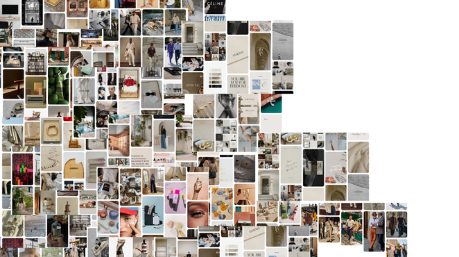
I helped Gab take her huge breadth of visual fashion knowledge and distill it into a brand she can take and run with.
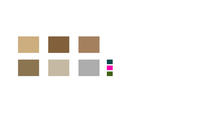
This included strategic positioning, competitor analysis, and a whole lot of theory research before getting to the nuts and bolts of colour, composition and media.
Together we took a somewhat unorthodox approach to brand building; Gab's ideas are fast flowing and wide ranging, and so the brand needs to flex with her as she works through her products and locks down the details over iteration after iteration.
So what stays constant in that iterative process? The feeling - how the brand, the interactions, the presence, the offerings make you feel.
How do you represent that in a brandmark, you ask?
Well, my solution was to create a totally new symbol for Gab and her brand Soph Life - the Soph character - that she could imbue meaning and feeling into.
This character is a combination of 2 existing characters: sigma and the open back rounded vowel.
We chose sigma through a lengthy process of meaning-making, paying tribute to the Greek origins of 'sofia' (wisdom) and the contemporary meaning of 'successful and highly independent'.
The open back rounded vowel is the International Phonetic Alphabet symbol for the 'o' sound in Soph - it's the British/Aus 'o' in 'soft' (not the 'o' in your mate Sophie's name). I included this symbol in anticipation of users looking at Soph Life and wondering how to pronounce it.
(Will anyone other than myself and Gab make this connection? Probably not. But now you can ;)
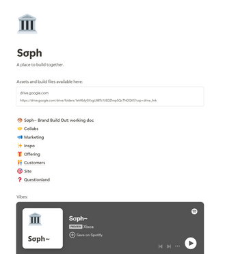
Giving space for Gab to create her band whilst building the brand visuals itself was a challenge; I overcame by creating the scaffold for her to think through the elements and co design with me (the Notion space pictured above).
Key to the expression in her brand is movement. Change, evolution, new, fresh, freedom. There's no better way to express this than in video form - so I created the splash video above.
And, in keeping with the freedom theme I created a site for Soph Life that Gab can change freely - she doesn't need me to hem her in - and I threw in some alternative version of the homepage to get her creative web design cogs turning.
I'm excited to see how Soph Life evolves and I'm honoured to have contributed to what I know will be a bright future for Soph Life and for Gab.


